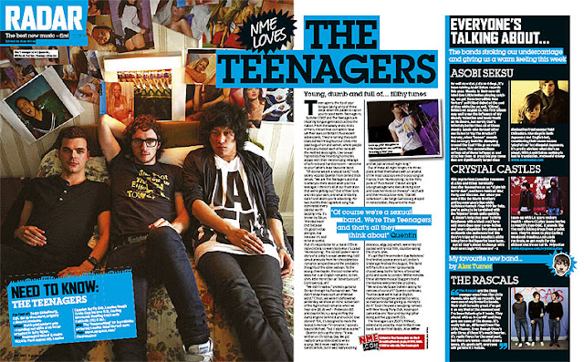
This double page spread feature not only has the article about the featured band but also a seperate section on the right hand side about new artists who are popular at the time. The distinction between the two sections is clear as they are divided by a pale blue line that sticks with the colour scheme on the page however there is a different background colour demonstrating the change in context.
This double page spread also shares key conventions of a double page spread including a floating quote which gives the reader an insight to what the article will entail making them curious and want to read on.
In the main image the band have been shot on location, in a bedroom that looks like it belongs to a teenage boy- relating back to the band's name: The Teenagers. This keeps the image and the text relevant to one another.
In this music magazine they have kept the text left aligned and also seperated the columns by a dividing line which keeps the page neat and makes it easier for the reader to navigate around the page.
The additional image embedded in the text is in a different location to the main image giving a different point of view to the band. The additional image is also of one of the band members performing in contrast to the obviously set up main image which shows the reader that the band are real about their music.

No comments:
Post a Comment